
Complex software.
A simpler experience.
A digital redesign for Progenesis, making enterprise lease and property management easier to understand, explore and enquire about.
Clarity is a competitive advantage.
Progenesis operates in a technically complex B2B category: enterprise lease and property management, IFRS 16 / AASB 16 accounting, automation and compliance. Prospective buyers need to understand what the platform does and why it matters before they consider booking a demo.
Our redesign focused on presentation, page structure, usability and the journey from first impression to meaningful enquiry. The goal was to make the digital experience more intuitive while keeping the enterprise credibility the brand needs.
The work speaks screen by screen.
A closer look at the real pages: the main brand experience, Petra software, lease management and the enquiry journey. Each preview links to its live counterpart.
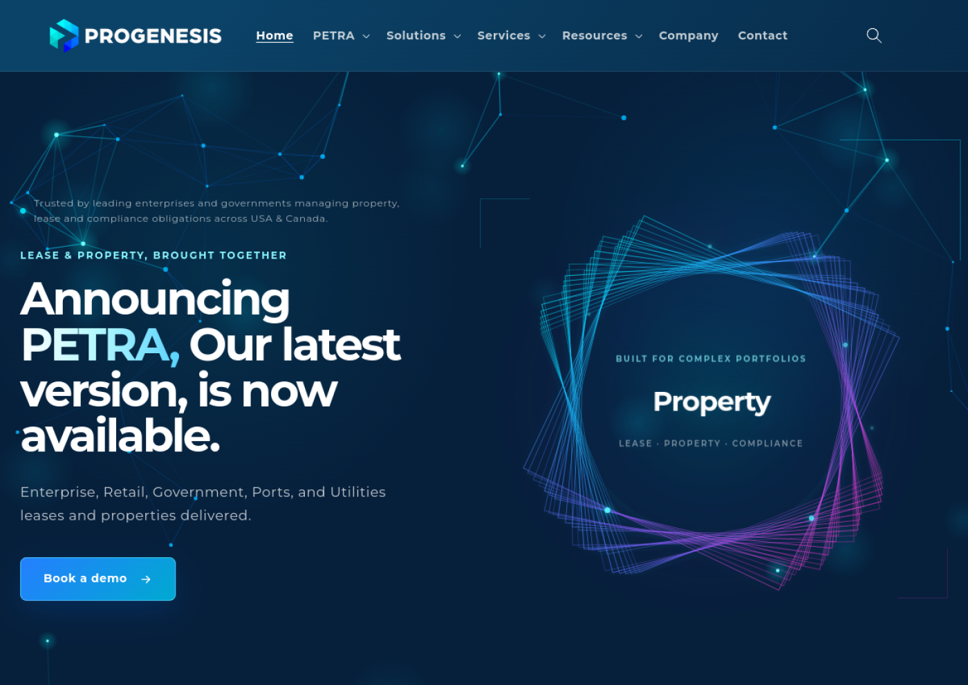
A clear introduction to a complex platform.
A confident first impression, an understandable product promise and a direct route to a demonstration.
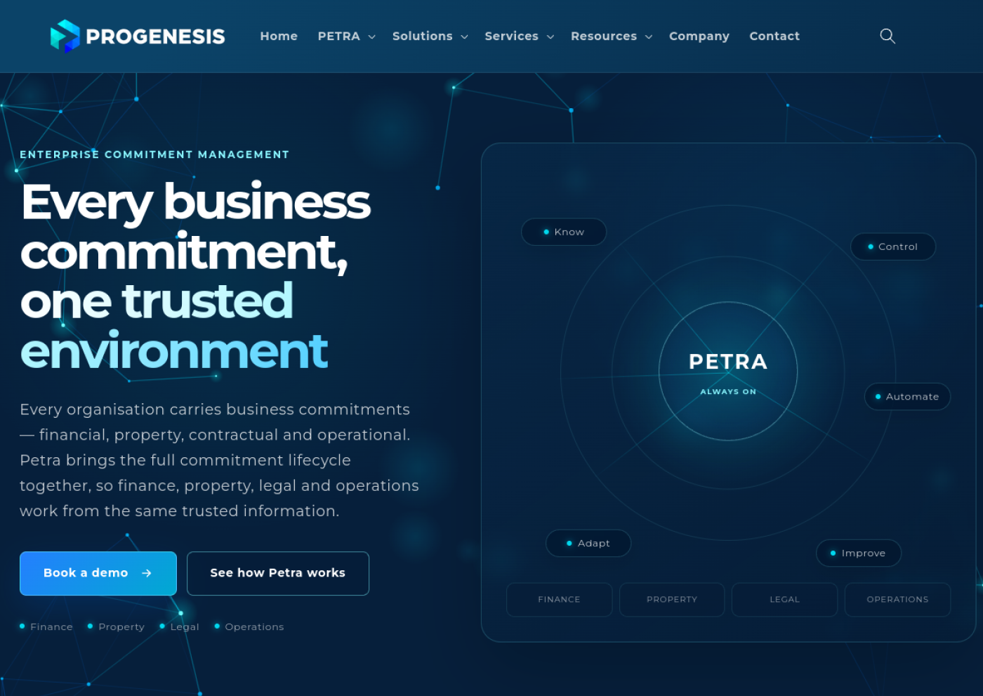
A clearer story for Petra.
The platform narrative brings commitments, AI, workflow and operations together into a more digestible journey.
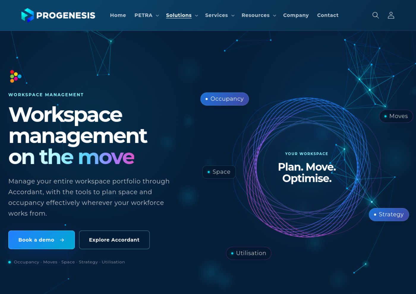
Making workplace management easier to explore.
The Accordant page shows how clear messaging, focused visuals and demo pathways help enterprise visitors understand a specialist software solution.
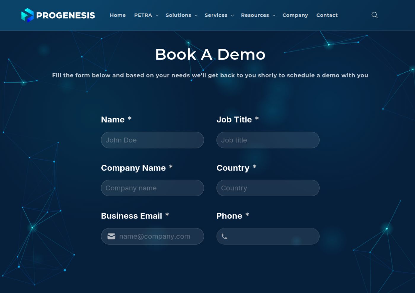
From understanding the offer to taking action.
A dedicated demo path keeps the next step visible and gives prospective customers a clear reason to get in touch.
Page images are requested from a third-party website screenshot service and may load with a delay. If a capture cannot be loaded, an editorial illustration of that page appears instead. The illustrations are not presented as literal screenshots. Screenshots reflect the live pages at capture time, not a before-and-after comparison.
Better experience, by design.
Our contribution focused on the website and its customer experience, rather than the underlying Progenesis software product.
Clearer user journeys
Organising complex solutions into understandable paths for property, finance and enterprise decision-makers.
Confident visual hierarchy
Cleaner page composition, more purposeful messaging and visual consistency across key destinations.
Responsive execution
Turning the designs into a usable website experience that works across desktop, tablet and mobile.
Beautiful is good.
Useful converts.
A strong B2B website should help visitors move from curiosity to confidence. The conversion journey was designed around clear explanations, relevant solutions, visible trust and a natural next step: book a demo.
Explore the live website inside this page
Some sites block embedding for security. If the live preview does not appear, open Progenesis in a new tab ↗.
Make complexity feel effortless.
Need a website that communicates what you do clearly and gives customers a better reason to take action? Let's build it.
Let's talk about your website ↗← Back to all case studies